Slides
Introduction
This case study explores the journey of implementing a user-centric dark mode for Kijiji's mobile application.
Focused on enhancing user experience and accessibility, the project entailed developing a comprehensive dark mode style guide and a seamless user journey for theme selection. Through strategic design and UX operations, this initiative aimed to provide users with the flexibility to choose their preferred theme, thereby improving user satisfaction and engagement.
Problem Statement
Challenge Addressed
Users increasingly seek customizable app interfaces to suit their preferences and reduce eye strain in low-light conditions. Kijiji lacked a dark mode option, affecting user retention and app usability during night-time hours. Dark mode has also become an industry standard in the product landscape, with rules and guidelines established by various design systems.
User Pain Points
- Difficulty using the app in low light, leading to eye strain and reduced session times.
- Inaccessible and difficult to use for users with visual impairments, such as photophobia (light sensitivity).
Business Implications
Potential decrease in user engagement, expectation and satisfaction, impacting Kijiji's market competitiveness.
Goals & Objectives
Primary Goal
- Enhance User Experience through Dark Mode Integration. To introduce a Dark Mode feature in the Kijiji mobile app that aligns with the highest standards of user accessibility and preference, ensuring a comfortable, customizable browsing experience across all lighting conditions.
Objectives
- Enhance User Experience through Dark Mode Integration
- Develop a Comprehensive Dark Mode Style Guide
- Facilitate User Choice for Theme Selection
Discovery Phase
Dos and Don'ts of Designing for Dark Mode
Inspiration was drawn from Material UI's Dark Mode guidelines, alongside a thorough analysis of various design systems for benchmarking. User testing and stakeholder feedback formed the backbone of our discovery phase, ensuring the design direction was both innovative and user-focused.
- Research Methods. Benchmarking against leading design systems, user feedback collection, and stakeholder consultations.
Dos
- Use Dark Gray Instead of Pure Black. Pure black can create a high contrast with text and other elements, making it harder to read. Using dark gray offers a softer contrast that is easier on the eyes.
- Adjust Color Saturation and Brightness. Bright colors can be more glaring against dark backgrounds. Reduce saturation and brightness to maintain legibility and comfort.
- Ensure Adequate Contrast. While you want to avoid harsh contrasts, ensuring enough contrast between text and background is crucial for readability. Follow accessibility guidelines like the WCAG to ensure text is easily readable.
- Test with Real Users. Different users have different preferences and sensitivities. Testing your design with a real audience can help you understand how your choices affect user experience.
- Provide an Easy Toggle Between Modes. Allow users to easily switch between light and dark modes based on their preference or ambient conditions. This enhances user autonomy and comfort.
- Ensure Parity between Light and Dark Mode. Users should have a seamless experience when they switch their themes, avoiding confusion when they see the UI in a different set of colors.
Don'ts
- Don't Ignore System Settings. Many devices allow users to set their preference for dark mode at the system level. Your application should respect this setting by default.
- Don't Use the Same Assets for Both Modes. Icons, images, and other assets may need to be adjusted for dark mode to ensure they are clear and visually appealing.
- Don't Overuse Pure White. Just as pure black can be too harsh, pure white can be blinding in dark mode. Use softer tones of white or off-white for text and other elements.
- Don't Forget About Opacity and Shadows. These elements may need to be adjusted in dark mode to ensure elements are distinguishable and maintain depth and separation.
- Don't Overlook Disabled Elements. Ensure disabled text and UI elements are still distinguishable in dark mode, using color and opacity effectively.
- Don't Neglect Accessibility. Dark mode should also be accessible to all users, including those with visual impairments. Ensure your design meets accessibility standards.
Design Ops & Stakeholder Alignment
The project was split into two main components:
- Creating foundational style guide on Figma for designers. For ease of design and to leverage the color libraries feature on Figma, it was crucial to add dark mode colors to the existing library.
- Implementing the global colors on the component library. After adding the colors to the Figma library, the next priority was to implement the global colors on the existing components as variants so it's easy for designers to create mockups using the dark mode UI kit.
Collaboration with stakeholders was crucial to align the project goals with Kijiji's vision, ensuring a smooth transition between design and development phases.
- Stakeholder Engagement. Regular meetings and feedback sessions with stakeholders were conducted to align the project goals with business objectives and user needs.
- Iterative Design Process. Adopted an iterative approach, incorporating stakeholder feedback and user testing insights into the design process to refine the dark mode theme and user journey.
Design Process
Developing a New Color Palette
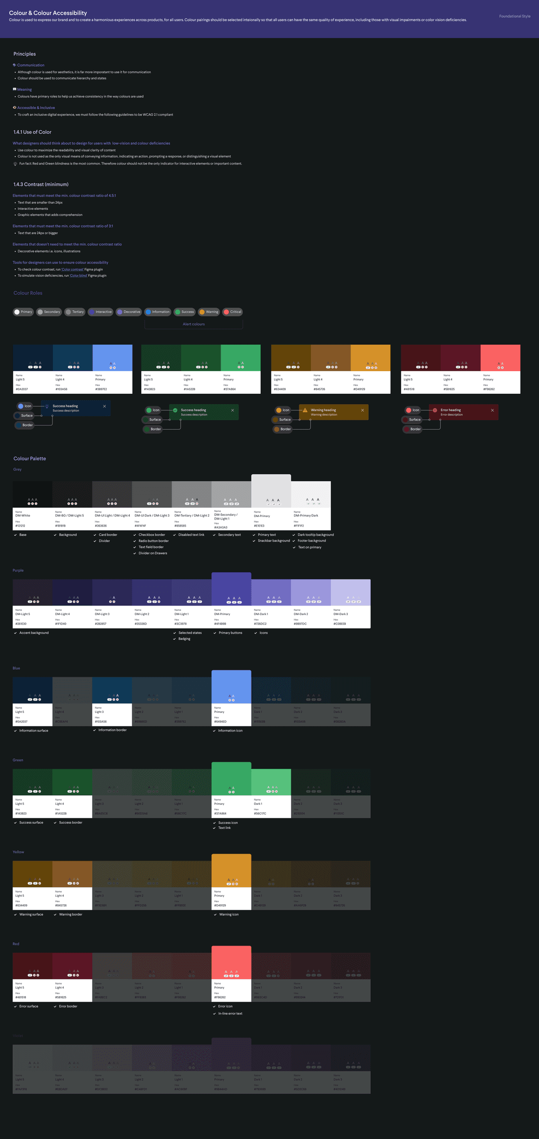
- Color Experimentation. Engaged in hands-on experimentation with competitive benchmarking to identify industry trends. I began drafting the colour palette focusing on aesthetics and accessibility.
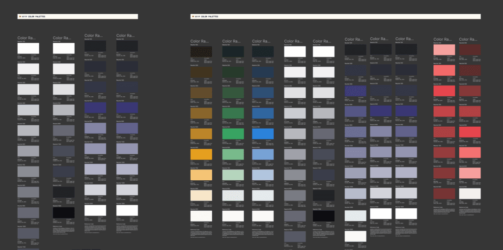
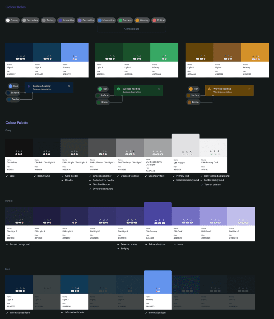
- Primary Background Color. I selected a dark grey, avoiding pure black, to serve as our primary background color. This choice was made to minimize eye strain and create a visually soothing experience for nighttime browsing.
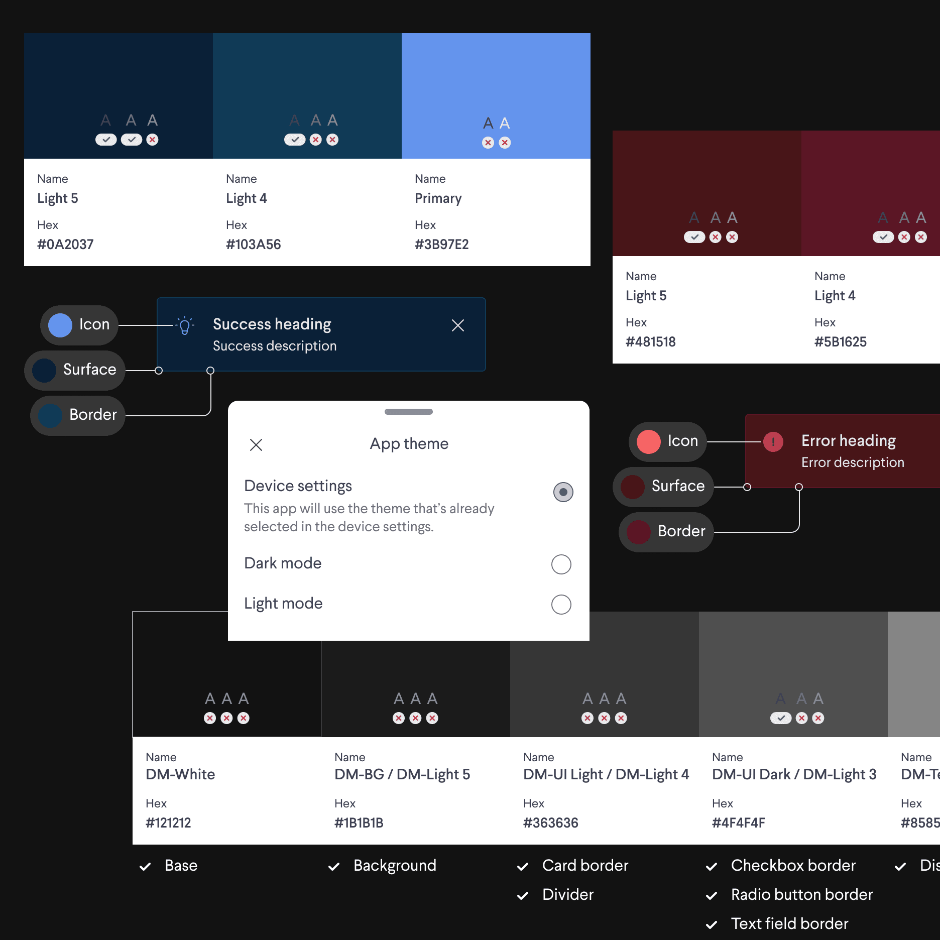
- Secondary Colors. I adjusted our secondary colors for text, icons, and UI components, ensuring optimal contrast against the dark background while staying true to our brand identity.
- Accent Colors. For our accent colors, critical for highlighting call-to-action buttons and important features, I opted for tones that would pop against the dark backdrop yet remain gentle on the eyes.
- User Testing. Conducted user testing sessions to gauge the effectiveness of different color schemes in meeting user expectations and accessibility standards.
Implementing the Palette in Figma
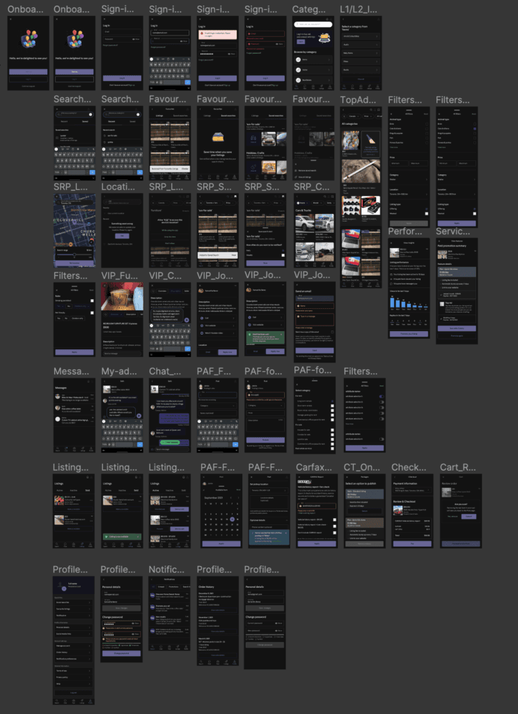
With our new color palette defined, the implementation phase commenced. Using Figma, I meticulously applied our chosen colors to the existing UI kit, transforming each component to align with our dark mode vision. This process involved:
- Adapting Components. Every component, from buttons to text fields, was revisited. I ensured that they not only adopted the new color scheme but also maintained legibility and aesthetic appeal in dark mode.
- Prototyping and Feedback Loop. Prototypes were then crafted within Figma, simulating real-world application use. These prototypes underwent rigorous user testing, providing invaluable feedback that guided iterative improvements.
User Journey for Theme Selection
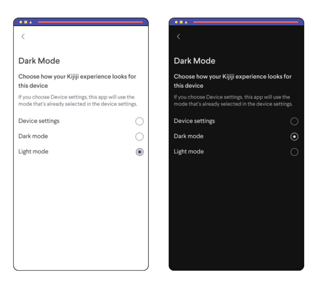
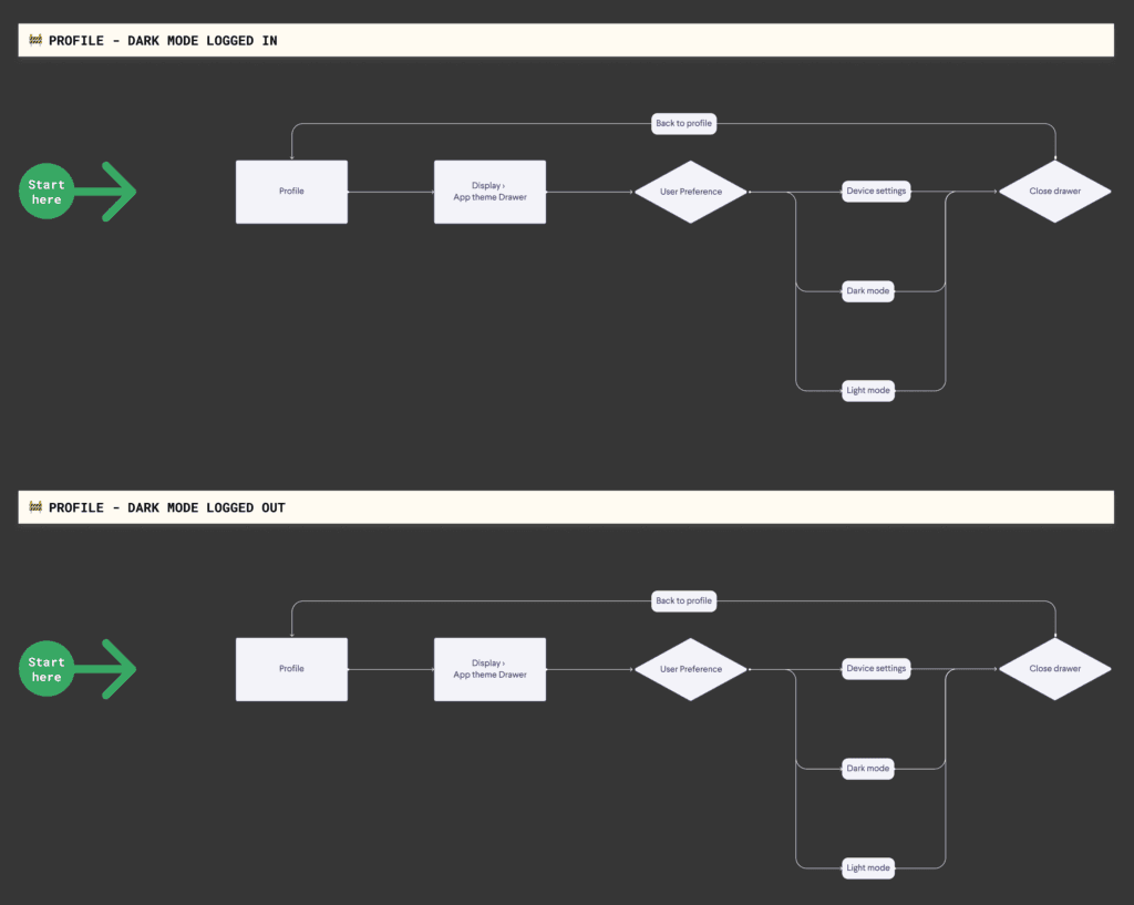
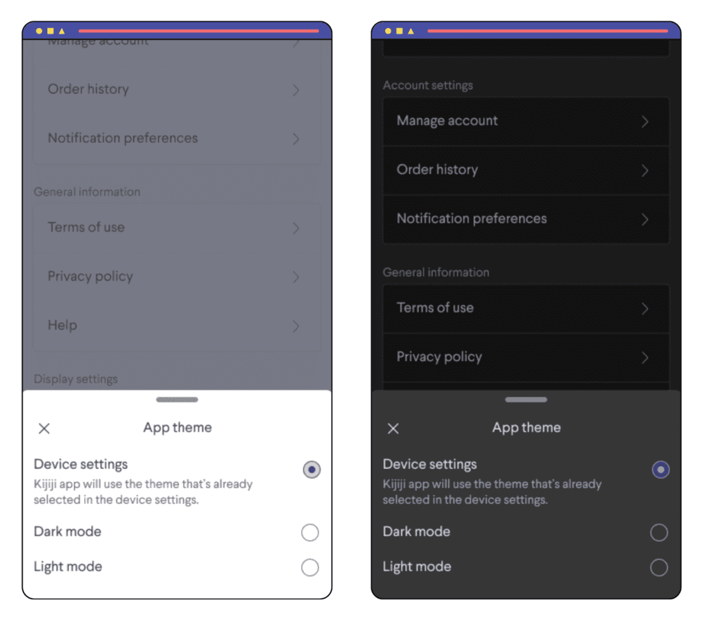
- Entry Point (Profile). Integrated the theme selection option within the user's profile settings to ensure easy access without cluttering the app interface.
- Theme Application. Enabled immediate application of theme changes to allow users to quickly experience and decide on their preferred theme setting.
- Tooltip Guidance. Implemented session-controlled tooltips to guide users to the new theme selection feature, enhancing user awareness and engagement.
Accessibility and Final Touches
A critical aspect of my design process was ensuring our dark mode met the highest standards of accessibility. Utilizing Figma's contrast checker, I fine-tuned the color palette to exceed WCAG guidelines, guaranteeing that our app remained accessible to all users.
Dynamic Theme Switching
- Flutter Implementation. Leveraged Flutter to implement dynamic theme switching, adding colors to ThemeData to facilitate real-time theme changes.
- Technical Challenges. Faced and overcame challenges related to ensuring smooth theme transitions and maintaining app performance during dynamic theme changes.
Dev & QA Support
Dynamic Theme Switching
Collaboration with the development team was key in translating the design vision into a tangible user experience. Detailed documentation of color codes and component specifications facilitated the handoff, while involvement in QA testing ensured fidelity to the design intent.
Launch Strategy
- Documentation & Coordination. Close coordination with developers for theme implementation using Flutter. Provided documentation of detailed style guides and facilitated any requirements, feedback and changes.
- QA Testing. Actively participated in the bug bashes and testing phases to address any discrepancies before MVP roll out.
Launch & Implementation
The user-centric approach extended to the launch phase, with tooltips introduced to guide users towards the new theme selection feature. This strategy prioritized immediate usability and personalization, allowing users to effortlessly switch themes based on their preference or system settings.
- MVP Rollout Plan. Staggered launch with initial tooltips guiding users to the theme selection feature.
- Beta Testing Insights. Utilization of session-controlled tooltips to enhance user awareness and engagement with the Dark Mode feature.
Conclusion & Impact
- Increased user engagement. Post-implementation, there was a notable increase in user engagement and satisfaction, with positive feedback on the dark mode feature's usability and accessibility.
- Success metrics. Successfully met and exceeded WCAG AAA and AODA accessibility guidelines, making the app more inclusive and user-friendly.
- Professional Growth. The project showcased my ability to balance user needs with technical requirements, manage stakeholder expectations, and deliver a highly demanded feature that significantly improved the user experience.
Lessons & Reflection
This project underscored the importance of integrating user feedback into the design process, highlighting the value of accessibility and personalization in enhancing the user experience. Learning to navigate the complexities of creating a design language and theme implementation in Flutter provided valuable knowledge into dynamic theme switching, enriching my skills as a designer.
- Personal Growth. Enhanced understanding of accessibility standards and the technical aspects of theme implementation.
- Next Steps. After wrapping up the project, the design team recognized the need for boolean-style components in Figma for easy handoffs for both light and dark mode. The initiative was driven by me as I was the subject matter expert for accessibility and design ops.